

In the digital age, attention is currency. Capturing and keeping it is harder than ever with overflowing inboxes, busy feeds, and constant notifications. That’s why a no code landing page for your newsletter isn’t just a nice-to-have—it’s essential for building a high-quality, engaged email list.
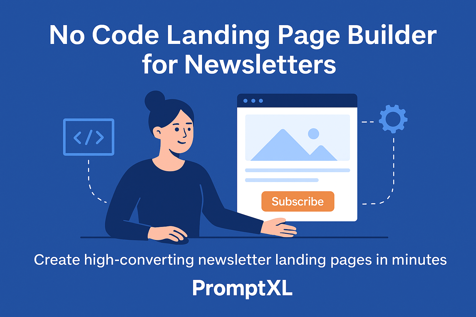
The challenge? Most businesses don’t have weeks of development time or the budget to hire developers and designers just to create a landing page. That’s exactly where a no code landing page builder like PromptXL changes the game.
With PromptXL, you can create high-converting newsletter landing pages in minutes. Just describe what you want in natural language, and the AI-powered builder generates a fully functional landing page—complete with forms, design, integrations, and backend—ready to capture leads.
In this blog, we’ll cover:
- Why your newsletter needs a dedicated landing page
- The anatomy of a high-converting landing page
- Common mistakes to avoid when building one
- How to optimize for conversions
- And how PromptXL makes the process effortless with no code
By the end, you’ll not only understand why newsletter landing pages matter—you’ll know how to build one faster, smarter, and better with the right tools.
Why a No Code Landing Page is Essential for Growing Your Newsletter
Think of your newsletter landing page as a VIP entrance. Unlike a cluttered homepage, it’s laser-focused on one thing: getting visitors to subscribe.
Here’s why it works better than just adding a signup form to your homepage:
- Eliminates distractions – Visitors aren’t pulled toward your blog, product pages, or contact form.
- Increases conversions – Every word, image, and button serves a single purpose: turning readers into subscribers.
- Builds credibility – A dedicated space signals that your newsletter is important and worth joining.
- Creates a direct connection – You own the relationship with subscribers, unlike social media followers where algorithms decide visibility.
With an optimized landing page, your casual visitor becomes a loyal reader.
How a No Code Landing Page Cuts Through Website Noise
Most websites are noisy. Navigation bars, popups, competing CTAs, endless links—there’s too much going on. Even if someone arrives with the intent to sign up, distractions derail them.
A newsletter landing page solves this. By stripping away every unnecessary element, it funnels attention directly to the subscribe button. This frictionless path makes signing up feel immediate and simple.
In marketing terms, you’re reducing cognitive load—making the right choice the easiest choice.
How a No Code Landing Page Builds a Direct Audience Connection
Your email list is one of your most valuable business assets. Unlike rented audiences on platforms like Facebook or X (Twitter), you own your list.
A well-built email signup page is the first handshake of that relationship. It’s where you:
- Set clear expectations – Tell subscribers what they’ll get, how often, and why it’s valuable.
- Establish credibility – Show testimonials, subscriber counts, or previews of past issues.
- Communicate your value – Highlight why your newsletter is different and worth their attention.
When done right, this landing page becomes your growth engine—feeding your funnel with engaged readers who genuinely want to hear from you.
The Anatomy of a High-Converting No Code Landing Page
A high converting landing page isn’t about flashy design—it’s about clarity and persuasion. Let’s break down the core components:
| Component | Purpose |
|---|---|
| Compelling Headline | Grabs attention and communicates the main benefit immediately. |
| Clear Value Proposition | Answers “What’s in it for me?” right away. |
| Persuasive Copy | Explains the benefits, builds trust, and removes doubts. |
| Social Proof | Testimonials, subscriber counts, or endorsements establish credibility. |
| Simple Signup Form | Fewer fields = less friction. Usually just an email address. |
| Strong Call-to-Action (CTA) | A button with action-driven text like “Get Weekly Insights.” |
| Visually Appealing Design | Clean, on-brand, mobile-friendly, and distraction-free. |
When these elements work together, your landing page becomes a conversion machine.
Crafting Irresistible Headlines for No Code Landing Pages
Your headline is your single most important copy element. It answers the question in every visitor’s mind: “Why should I care?”
Weak headline: “Subscribe to Our Newsletter.”
Strong headline: “Get Smarter About Marketing in 5 Minutes a Week.”
The difference? One is generic, the other communicates specific benefits.
Creating a Clear Value Proposition on Your No Code Landing Page
If your headline is the hook, the value proposition is the substance. It tells people what to expect and why it matters.
Examples:
- “Actionable growth hacks every Monday morning.”
- “Curated crypto news you won’t find anywhere else.”
- “Simplified tech insights delivered weekly.”
Clarity here is non-negotiable. Ambiguity kills conversions.
Adding Social Proof to Your No Code Landing Page
People trust people. Adding social proof increases conversions by reducing perceived risk.
Ways to add it to your email signup page:
- Subscriber count: “Join 25,000+ readers.”
- Testimonials: “This newsletter saves me hours every week.”
- Logos: Display media features or partner brands.
- Expert endorsements: A quote from an authority in your field.
These trust signals reassure visitors that subscribing is a safe and smart choice.
Designing a Frictionless Signup Form in a No Code Landing Page
Your form should be as short as possible. For most newsletters, just an email field is enough.
Why? Every additional field adds friction and reduces signups.
Also, make your CTA button action-driven:
- ❌ Weak: “Submit”
- ✅ Better: “Subscribe Now”
- 🚀 Best: “Send Me the Insights”
Pro tip: write your button copy to complete the sentence, “I want to…”. For example: “I want to get smarter today.”
Design Principles for No Code Landing Pages That Convert
Good design isn’t just pretty—it guides the eye.
- Visual Hierarchy – Headline > Subheadline > CTA.
- Whitespace – Avoid clutter; make elements breathe.
- Mobile-First – Most users browse on phones. Optimize for small screens first.
- Simplicity – Pages with fewer distractions and shorter copy convert better.
- Video Integration – A short explainer video can boost conversions by 30%+.
When your design leads visitors smoothly toward the CTA, conversions follow.
Common No Code Landing Page Mistakes to Avoid
Even small errors can tank your conversion rate. Here are the big ones:
- Multiple CTAs – Stick to one primary goal: subscribe.
- Weak headlines – Don’t waste your most valuable real estate.
- Long forms – Asking for phone numbers kills signups.
- Lack of social proof – You’re asking for inbox access—prove you’re trustworthy.
- Navigation menus – Remove links; they’re just exit ramps.
Avoiding these mistakes is half the battle to creating a high converting landing page.
Measuring & Optimizing Your Newsletter Landing Page
Getting your landing page live is just the start. The real magic is in optimization.
Key Metrics to Track
- Conversion Rate – % of visitors who subscribe.
- Bounce Rate – % who leave without interacting.
- Time on Page – Measures engagement.
- Traffic Sources – See which channels send high-quality visitors.
The Power of A/B Testing
Test one element at a time:
- Headline variations
- CTA button text & color
- Number of form fields
- Social proof style (testimonials vs. subscriber counts)
Data removes guesswork. Over time, small optimizations add up to big gains.
Real-World Examples of High-Converting Newsletter Pages
1. Morning Brew – Simplicity Wins
Headline: “The daily email that makes reading the news actually enjoyable.”
- Clear promise
- Single CTA
- Social proof: 4M+ readers
2. Milk Road – Niche Authority
Headline: “Get smarter about crypto.”
- Crypto-focused design & copy
- Endorsements from industry leaders
- FOMO-driven community feel
3. The Gist – Transparency Works
- Shows actual newsletter preview
- Punchy headline
- Simple signup form
Each of these pages follows the same formula: clarity, focus, and proof.
How PromptXL Makes Building No Code Landing Pages Effortless
Traditionally, creating a newsletter landing page meant hiring:
- A designer for layout
- A developer for backend + form integration
- A project manager to oversee everything
That’s expensive and slow.
With PromptXL, you skip all of that. Here’s how:
- AI-Powered Creation – Just describe your newsletter page in plain English. PromptXL builds it.
- No Code Required – Databases, forms, workflows, and backend are auto-generated.
- Built-In Landing Page Builder – High-converting templates optimized for signup flows.
- Instant Deployments – Go live in minutes, not weeks.
- Scalability – Pages grow with your audience, no rebuild needed.
In short: PromptXL is the fastest way to launch a no code landing page that actually converts.
Final Thoughts: Build Smarter, Convert Faster
Your newsletter landing page is your gateway to building a loyal audience. Done right, it transforms casual visitors into engaged subscribers who look forward to your emails.
But building one shouldn’t take weeks of development or thousands of dollars.
With PromptXL’s no code landing page builder, you can:
- Launch pages in minutes
- Focus on content & value instead of coding
- Optimize conversions with AI-powered layouts
- Scale effortlessly as your audience grows
👉 If you want to create a high converting newsletter landing page without the hassle, PromptXL is your ultimate solution.
Releated Topic: Web Application Architecture