


Why Responsive Design Matters More Than Ever
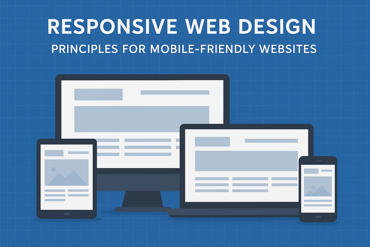
Imagine trying to read a newspaper through a keyhole—frustrating and incomplete. That’s how users feel when they land on a non-responsive website with their smartphone. Responsive web design ensures your website adapts to any screen size, just like water naturally takes the shape of its container.
With more than 59% of global website traffic coming from smartphones (Q4 2022), it’s no surprise that responsive web design has become a business-critical necessity. About 90% of websites today use responsive principles, yet a staggering 73.1% of users abandon non-responsive sites. This means that responsiveness isn’t optional—it’s essential to creating seamless websites that attract, engage, and retain users.
The Mobile-First World: Shaping Modern User Expectations
As smartphone usage exploded, many businesses initially struggled. Sites built for desktop screens looked broken on mobile, resulting in poor experiences and lost customers. Responsive design principles bridge this gap, helping businesses thrive in a mobile-first world where:
- Mobile usability impacts Google search rankings.
- High bounce rates indicate poor user experience.
- Seamless mobile design improves engagement and conversion rates.
This shift means every modern business must prioritize mobile-friendly design as a foundation for success.
The Business Impact of Responsive Web Design
Responsive websites directly influence measurable business metrics:
- Bounce Rate Reduction: Users are more likely to stay and explore when navigation is smooth across devices.
- Higher SEO Rankings: Google rewards mobile-friendly sites, pushing them up in search results.
- Conversion Improvements: A responsive checkout process, for example, prevents mobile cart abandonment.
In short, investing in responsive design is not just about aesthetics—it’s about revenue, customer trust, and long-term growth.
From Fixed Layouts to Flexible Digital Experiences
In the early internet days, websites were like fixed houses—built for one specific lot (screen size). They looked fine on desktops but collapsed on smaller devices.
The mobile revolution forced a redesign of web design principles. Ethan Marcotte’s landmark 2010 article introduced the term “Responsive Web Design”, championing:
- Fluid Grids (proportional layouts instead of fixed pixels)
- Flexible Images (scaling with screen size)
- CSS Media Queries (conditional styling per device)
By 2015, responsive design became mainstream, with over half of European SMBs embracing mobile optimization. Today, these three pillars remain the core foundation of seamless websites.
The Three Pillars of Responsive Web Design
1. Fluid Grids: The Flexible Foundation
Instead of rigid pixels, fluid grids use percentages so elements resize proportionally. Picture adjustable closet shelves—everything shifts neatly to fit available space.
2. Flexible Images: Scaling Without Distortion
Flexible images scale within their containers using CSS rules like max-width: 100% and height: auto. This prevents overflow and distortion, keeping visuals crisp on every screen.
3. Media Queries: The Responsive Conductor
Media queries apply different styles based on conditions like screen width or orientation. They act like an orchestra conductor, ensuring layouts adjust seamlessly from smartphones to desktops.
Together, these principles form the bedrock of modern web design.
Mobile-First Design: Starting Small, Scaling Big
Designing for mobile-first is like starting with a motorcycle before scaling up to a car—it’s efficient, focused, and built for mobility.
Key Benefits:
- Content Prioritization: Smaller screens force you to focus on what matters most.
- Progressive Enhancement: Start with essentials, then add features for larger devices.
- User Psychology: Mobile users are quick, thumb-driven, and often multitasking. Designing for them requires bigger buttons, simple menus, and thumb-friendly navigation.
Brands like Airbnb, Dropbox, and Spotify thrived by prioritizing mobile-first strategies, reporting higher engagement and conversions.
Mastering Breakpoints: Seamless Transitions Between Devices
Breakpoints are the design thresholds where layouts adapt. Instead of relying solely on device widths, content-driven breakpoints are better—change layouts where the content itself starts looking cramped.
Common Breakpoint Strategies:
| Strategy | Example Values | Pros | Cons |
|---|---|---|---|
| Mobile-First | 320px, 768px, 1024px | Optimized for mobile, efficient CSS | Harder for large-screen-first design |
| Desktop-First | 1440px, 1024px, 768px | Familiar for older workflows | Performance issues on mobile |
| Content-Driven | Varies by content | Future-proof, user-focused | Requires analysis and testing |
| Device-Specific | Popular device widths | Easy setup | Quickly outdated as new devices emerge |
The best long-term approach is content-driven breakpoints—ensuring adaptability regardless of new screen sizes.
Performance Optimization: Speed Matters Everywhere
A seamless website is worthless if it loads slowly. Responsive web design must also prioritize performance optimization:
- Image Optimization: Use WebP, compress assets, and serve responsive images with
srcset. - Lazy Loading: Load resources only when needed.
- Minified Code: Shrink CSS/JS files for faster delivery.
- Service Workers: Enable offline caching for a smoother experience.
Tools like Google PageSpeed Insights help track performance and identify bottlenecks.
Responsive Web Design Workflow: Turning Theory into Practice
- Content Inventory – Identify and prioritize content for smaller screens.
- Wireframing – Sketch multiple screen layouts.
- Prototyping – Build clickable demos to test navigation.
- Development – Write clean, efficient HTML, CSS, and JavaScript.
- Testing & Deployment – Use tools like BrowserStack to validate across real devices.
Case Studies: Real-World Responsive web Design Transformations
Airbnb
- Simplified mobile booking flows.
- Increased time spent and higher conversion rates.
Dropbox
- Adopted a mobile-first redesign, improving engagement and cutting bounce rates.
BBC
- Optimized for smaller screens, ensuring easy navigation of complex content.
Results across all three:
- Higher user engagement (more time spent).
- Better conversion rates (completed actions).
- Improved business outcomes (brand trust and revenue growth).
Tackling Common Responsive web Design Challenges
- Complex Navigation: Use hamburger menus or simplified tab bars.
- Intricate Layouts: Rely on content-driven breakpoints.
- Interactive Elements: Ensure touch targets are large and hover states work across devices.
- Testing Across Devices: Real-world testing beats simulations.
Automated testing frameworks like Cypress or Selenium help ensure consistency.
Conclusion: The Responsive web Design Advantage
Responsive web design is no longer a luxury—it’s the backbone of seamless websites in today’s mobile-first digital ecosystem.
By embracing fluid grids, flexible images, and media queries, businesses can craft adaptable, user-focused designs. Adding mobile-first strategies, performance optimization, and real-world testing ensures a flawless experience across devices.
This responsive design guide proves that mobile-friendly design is both a user expectation and a business driver. Companies that invest in responsiveness today are setting the foundation for growth, customer loyalty, and competitive advantage tomorrow.
Related Topic:MVP Development for Startups